


TLDR
The Bitcoin rainbow chart is an indicator that has been used for nearly a decade to predict the long-term value of BTC. It has a logarithmic growth channel with varying rainbow color bands. This guide explains the origin of the rainbow chart indicator and how to use this unique visual representation of colors to spot buy and sell opportunities. It also highlights the benefits and limitations of the BTC rainbow chart.
Here are the colors in the Bitcoin rainbow chart and how to read them:
- Blue: Fire sale! Buy as much BTC as you can!
- Blue-Green: Still a good time to buy Bitcoin
- Green: Keep accumulating more coins
- Light Green: Bitcoin is still cheap
- Yellow: HODL!
- Light Orange: Is this a Bubble? Get ready to sell.
- Orange: FOMO increases, but you should start taking profits!
- Red: Sell BTC!
- Dark Red: Maximum bubble territory. SELL!

What is the Bitcoin Rainbow Chart Indicator?
The BTC rainbow chart indicator is a color-coded spectrum used to predict Bitcoin’s future price movements in the long term. The multiple colors on the pattern give it the name “rainbow indicator.” The rainbow indicator has five color groups and nine color bands in all. The color bands help traders identify potential buying and selling opportunities for the flagship cryptocurrency.
The rainbow chart contains historical price data of Bitcoin and has a logarithmic growth curve channel. This means that Bitcoin’s value appreciation over the years is meant to decline as time goes by. This price trajectory aligns with the law of diminishing returns.
Since Bitcoin has a very high daily volatility, it can be complicated to predict its price in the short term. On the other hand, long-term price predictions can be more accurate. Interestingly, the rainbow indicator has been used to accurately predict Bitcoin’s long-term price ranges for years. The indicator is more suitable for long-term investors than short-term technical analysts or scalpers.
Brief History of the Bitcoin Rainbow Chart
The Bitcoin rainbow chart was created in 2014 by a Reddit user known as Azop. Azop developed the rainbow chart pattern with a linear trajectory, cool colors at the lower side, and warmer upper colors. Some crypto community members believed the rainbow chart pattern was coined as a joke and was not to be taken seriously.
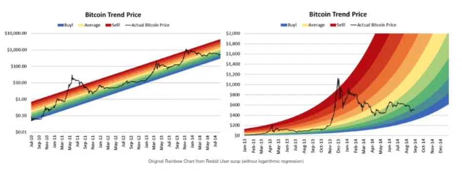
Later, though, Azop’s linear BTC rainbow pattern was improved on by a BitcoinTalk user named Trololo. Trololo called the newly developed pattern a V2 of the indicator. Trololo included logarithmic regression, making the full rainbow channel v2 different from Azop’s model with an exponential growth pattern.
Hence, rather than having a price pattern that would appreciate steadily over the years, we now have a pattern that would appreciate more rapidly in its earlier years and then experience slower appreciation in the future.
Trusted Partners

5.0
Fees
0.1 – 0.5%
Tradable Coins
600+
Payment Options
+ 3


4.7
Fees
0.01 – 0.10 %
Tradable Coins
100+
Payment Options
4.3
Fees
0.04% – 0.10%
Tradable Coins
145 +
Payment Options
How to Read the Bitcoin Rainbow Chart
The Bitcoin rainbow chart shows historical price trends and current market sentiment. This information is then used to make buy or sell investment decisions. The image below shows the Bitcoin rainbow chart.
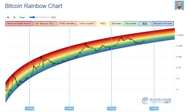
Here’s how to interpret the colors on the chart:
Blue

When Bitcoin’s price trends around the blue region, it is a fire sale. It is the lowest price range to buy Bitcoin. The Bitcoin price last ranged around this region in December 2022/January 2023. BTC traded as low as $15,700 in December 2022 before eventually bouncing back up in January 2023.
Blue-Green

According to the rainbow chart model, the Blue-green region is the second-best price level. At this point, Bitcoin’s price is gradually recovering from the bear market. It is called the “BUY zone.”
Green

As mentioned earlier, the green range is the accumulation range. It’s quite a stable region for BTC, and bullish investors accumulate more coins at this level. BTC looked to approach this zone in April 2023.
Light-Green

Like the green, the light-green region signifies another potential investment opportunity. At this point, investors using the rainbow model understand that this is not the cheapest price range to buy BTC. However, Bitcoin’s price still has the potential to soar from here.
Yellow

The yellow zone is different from earlier patterns. At this level, investors should HODL. At this point, Bitcoin’s price is at a fair value or just above the fair value. Now is not the best time to buy, neither is it the best time to sell. It’s the best time to hold Bitcoin. Investors expect better selling opportunities at a price level above the Yellow zone.
Light Orange

At this point comes an increase in buy volume. The price of Bitcoin soars at an alarming rate, and as the price moves, the crypto asset is labeled a bubble by critics. As a strategic investor, the best line of action would be to take partial profit.
Orange

The Orange region is the level where FOMO intensifies. Newbie traders jump in blindly at this point after missing out on early buy opportunities. During such periods, the bull market is about to reach its peak.
Red

The red region is the sell zone. At this point, Bitcoin is likely overvalued already, and a price correction may be imminent. Again, a strategic investor would likely sell at this point. Although, the red region is still not in the highest price range.
Dark Red

This zone is known as the maximum bubble territory. Crypto investors would consider offloading their highly-priced digital assets at this point. The euphoria in the market is at its peak, and BTC is due for a crash.
The Benefits of the Rainbow Chart Indicator
- So far, the rainbow chart indicator has been relatively accurate for projecting long-term price movements for Bitcoin.
- It is easy to analyze. It is less complicated than many other technical analysis tools.
- The indicator’s architecture and mechanism for accuracy can be improved from time to time.
The Limitations of the Rainbow Chart Indicator
- The Bitcoin rainbow chart is a long-term valuation tool. It can be inaccurate for making informed investment decisions in the short term.
- The indicator is not 100% accurate. It cannot be used to give solid investment advice.
- Other factors like trading volume and market sentiment must be combined with the indicator for better results.
The rainbow indicator has a wide range in 2024. Bitcoiners anticipate halving in 2024, and BTC’s price typically surges months after the halving event. On the rainbow chart, shortly after the halving, Bitcoin is expected to have a fair value within the $156,000 range, a peak value above $500,000, and a largely discounted value would be around $35,000.
The rainbow chart pattern can be used to analyze other cryptocurrencies too. There are other rainbow charts, like the Ethereum rainbow chart. Although, of all the charts, the BTC rainbow chart is the most popular.
Interestingly, BTC’s past performance proves that the rainbow indicator is more accurate for Bitcoin than Ethereum or any other cryptocurrency. This is partly because ETH and other altcoins are a relatively young asset class compared to Bitcoin.